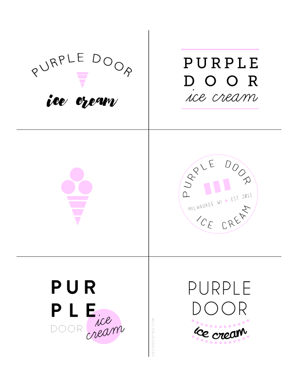
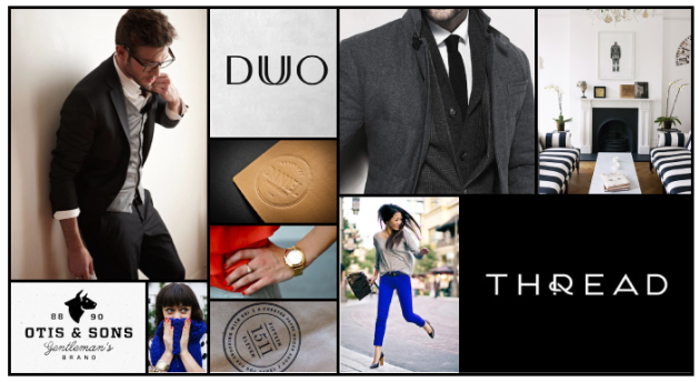
Today I’m happy to share some progress on a concept logo I’m working on for a local shop that I love. I wanted to create a brand that is playful and cheerful that mixes a bit of a retro vibe into a modern aesthetic. After creating this moodboard, I started working on these logo concepts. It’s always fun to share how the process goes! After refining, I’ll be working on some brand build out – stay tuned.
Category Archives: branding
moodboard: a modern man.
Today I am excited to share the moodboard for a web design project that’s been in the works since this summer. The brand is a very stylish girl who is offering styling and wardrobe services to male clients who are either too busy or handle their clothes or are looking for some professional guidance in their style. She herself is quite sophisticated and chic, and her business is all about style, service, and ease for her clients. I thought her business concept was so clever (I’ve only ever seen stylists catering to women, with perhaps an occasional man on the roster) and her aesthetic so up my alley that I had to be a part of it.
Her website needed a clean, modern aesthetic; simple and to the point for the busy businessman she appeals to. It had to both be masculine enough for her clients while also letting her own sense of style shine through. We settled on of mix of typefaces, including bold block letters and light, easy handwritten-type fonts {though nothing frilly} for occasional accents. The base of the color palette is black and white, with pops of cobalt and just a touch of poppy.
The website should be wrapping up soon, so I’ll be sharing it as soon as it’s live!
tips to build a strong brand.
Today, I’m sharing a few pointers for building a strong and memorable brand. It’s something you can employ whether you’re just starting out or already in the thick of things!
- Shout about what makes you extraordinary.
Think back to why you started your business, whether that was several years ago or last week. What drove you begin? Likely, it was because you felt you had something to offer the world, whether it was a product, a service, or yourself. What makes you just that bit different than your competitor?
Maybe you are an illustrator. There are tons of illustrators out there – what would make someone choose your service? You might be kick-ass at drawing faces or using pastels. If you’re a web designer (again, tons of us), you might be really awesome at designing functional sites for restaurants or unique styles for blogs. Whatever it is that makes your heart sing will help your business soar.
- Look to industries outside your own for inspiration.
Inspiration is everywhere. You may end up finding yourself closed in if you are only looking within your industry for ideas! That is where we get stuck copying or too-close-for-comfort iterations. For example, I doubt that if you are reading this, you own an airline company. However, Southwest is an awesome example of a very cohesive, strong brand. Everything from their website to their safety cards to their coffee cups display the Southwest personality and look. Your business may not have safety cards, but you can use the inspiration of their thorough cohesive branding as a model.
- Be willing to try something new, but don’t ignore best practices.
The fastest way to become out of touch is to get stuck in a rut or do something because you’ve “always done it.” The best brands are those that are always trying to innovate and make their businesses better. That being said, don’t lose your sensibility! There are certain times when it doesn’t pay to try something different. Make sure you are considering the standards of your industry and what you audience is going to expect.
One example could be with email marketing. Currently, studies say that most email campaigns are opened between 2-5pm on weekdays, with Tuesday and Thursday being the most popular days. Trying to stand out and choosing to send an email campaign on a Saturday at 8pm would be a silly idea! Sure, there won’t be many marketing emails going out at that time – but your audience won’t be reading. Trying a Monday or Wednesday would be a more logical experiment. Bottom line: don’t be different just for the sake of being different.
- Strive for timeless, not trendy.
“Oh my gosh, everyone has handwritten logos in black and white – I must get one!!” is not something you should think. It’s so tempting to hop on trend bandwagons, especially when it is a style you also happen to love. But, in order to avoiding a rebranding project every year or two, work really hard to build a brand that speaks to you business and your dream clients – not the latest styles on Pinterest. As Yves Saint Laurent said, “Fashions fade, style is eternal.”
.
What are some ways you have employed intention in your brand? I’d love to hear more ideas!
recent work: Media Bombshell brand & website design.
I’m so excited to share a new branding & web design project today! From the very first conversation I had with Ellie, I could tell she was bursting with life and enthusiasm for her business, Media Bombshell. She had recently filmed a new intro video for her business, which made her realize she was ready for a fresh look in both her brand and her website.
Ellie works with business owners to discover the power of their voice and speak confidently about their business, whether it be to their target audience, in a media interview, or on stage. With a background as an NBC reporter and spokesperson, she offers one-on-one services and is now expanding to have group offerings. As she put it, she wants “to be starting a mini revolution around language.” Sounds pretty inspiring to me!
We began crafting an identity that would convey savvy, professional, and sophisticated, but with lots of personality and bright color. Her old logo and photography had a bit more of a vintage vibe to it, and she wanted to make it feel more modern and fresh.
For her homepage, she wanted her new video to be front and center, as well as move her blog feed to the front. She wanted a clean aesthetic to keep it professional, and we used pops of color and lots of dots to keep it playful and energetic.
Be sure to visit Media Bombshell and see what Ellie is all about! She is a delight to work with. And, you can read a bit about her redesign experience in her blog post.
.
PS If you are looking to liven up your logo or rethink your homepage, I’m currently booking for July! Drop me a line – I’d love to hear your story!
4 simple tips to up your brand’s design level.
Whenever summer starts to approach, I always get anxious to clean out my workspace and my closet. (I think this is leftover from the school year ending each year growing up and getting to clean up and start over!) Nowadays, I also start itching to clean up my website and marketing materials!
Now, developing a full and cohesive brand is no simple, finish-in-20-minutes task. But, fear not! While every business and person is different, there are a few items that anyone can apply to his or her brand and instantly up the level of professionalism.
1) Consistency is imperative.
The most important way to establish your brand is with consistent design. Each page on your website should feel like it goes with the others. Your business card should be an extension of your website’s branding. All the images in your blog posts should be the same width (please!). When customers see themes, they will begin to associate them with your brand. Think: black & white stripes of Sephora or the use of florals in Rifle Paper Co.
2) Stick with a color palette.
Color is one of the most powerful tools in your design belt. Different colors evoke different emotions and messages, and choosing them wisely can positively affect your brand. Some people love color and try using a rainbow of hues on every page. Others are color shy and only use black and white. Somewhere in the middle is probably where you should aim! I recommend establishing a primary color, a secondary color, and a neutral. The easiest place to start is by taking cues from your logo. Which of these would you rather read?
.
3) Choose only 2-3 fonts.
An easy way to make your reader tired is to use a myriad of fonts all on one page. The brain has to shift so many times that it won’t comprehend what it’s reading. If you like artistic or handwritten fonts, use these in a headline where the phrase will only be a few words. Use a simple, easy-to-read font for your body copy. These fonts should contrast each other, but still coordinate. See for yourself:
.
4) Simplicity is your friend.
Your reader’s motto is always, “Don’t make me think.” You don’t want anyone to struggle to figure out what to do when visiting your site or reading your materials! Keep your message and your call to action clear. This doesn’t mean you have to resort to an extremely minimalist aesthetic and not infuse personality and details into the brand. But, if your website has too much going on, the reader won’t know what to look at and will like move on. Which of these sites would you rather look through? {wink wink}
.
P.S. Feeling inspired, but totally overwhelmed in designing your logo, brand, or site? I’d love to help! Let me worry about finding colors, fonts, and layouts while you keep busy in your actual business. Drop me a line and tell me your story!


